 |  |

If you are a style sheet coder, you must be aware of the impact of HTML tag and element containment on style attribute inheritance. If you are a page designer, however, you need to understand the more fundamental visual impact of a particular type of HTML element: the block-level element. A block-level element is a self-contained unit of content that normally begins at the starting margin of one line and ends in a way that forces the next bit of content to appear on a new line following the block. Each of the heading tags (h1, h2, etc.) is a block-level element because by default, it stands alone on a line (unless you use DHTML positioning tricks to overlay other elements). Other common block-level elements are p, ul, ol, li, and div.
A CSS-enabled browser automatically defines a set of physical features to every block-level element. By default, the values for all these features are set to zero or none, so that they don't appear or occupy space on the page when you use simple HTML tags without style sheets. But one of the purposes of style sheets is to let you modify the values of those features to create graphical borders, adjust margin spacing, and insert padding between the content and border. In fact, those three terms—border, margin, and padding—account for about one-fourth of all CSS2 style sheet attributes.
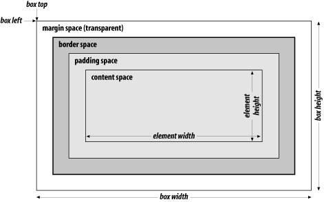
You can think of the content and features of a block-level element as a box. To help you visualize the role and relative position of the features of a block-level element, Figure 3-2 shows a schematic diagram of a generic chunk of block-level content (imagine it's a paragraph, if that helps), where the margin, border, and padding are indicated in relation to the content. The width and height of the content do not change, even when extra stuff is tacked on outside of the content.[2] Each of the surrounding features—padding, borders, and margins—can occupy space based on its corresponding dimensions. The width and height of the entire box is the sum of the element content, plus padding, borders, and margins. If you don't assign any values to those features, their dimensions are zero and, therefore, they contribute nothing to the dimensions of the box. In other words, without any padding, borders, or margins, the content and box dimensions are identical. With style sheets, you can assign values to your choice of edges (top, right, bottom, or left) for any feature.
[2]This is the way IE 6 for Windows works when in standards-compatible mode (see the <!DOCTYPE> element discussion in Chapter 8). In backward-compatible mode and earlier versions, the browser includes the border and padding in its height and width calculations.

All margin space is transparent. Thus, any colors or images that exist in the next outer containing box (the body element always provides the base-level box) show through the margin space. Borders are opaque and always have a color associated with them. Padding space is also transparent, so you cannot set the padding to any color; the background color or image of the content shows through the padding space. Thus, this space "pads" the content to give some extra breathing room between the content and any border and/or margin defined for the element.
Some style sheet attributes provide a one-statement shortcut for applying independent values to each of the four edges of the margin, border, or padding. For example, you can set the top and bottom border widths to one size and apply a different size to the left and right sides of the same border. When such shortcuts are available (see the border, margin, and padding style attributes in Chapter 11, the values are applied in the same order: clockwise from the top—top, right, bottom, left.
While the content dimensions remain the same regardless of the dimensions assigned to various box features, the size of the box expands when you assign padding, borders, and margins to the element. As you will see in Chapter 4, the "thing" that gets positioned within the various coordinate planes is the box. The left and top outer edges of the box are emphasized in Figure 3-2 to reinforce this idea.
It is important to understand the difference between a piece of content and its containing box, especially if you start nesting positioned elements or need to rely on extremely accurate locations of elements on the page. Nesting multiple block-level elements inside each other offers a whole range of possible visual effects, so page designers have much to experiment with while developing unique looks.

Copyright © 2003 O'Reilly & Associates. All rights reserved.